


Hi Friend! 👋
I’m deeply grateful for all the new investors across the world who join The MarketFighter Strategy every day. Welcome to all of you.
While I live in Europe (Denmark) myself, a large part of you subscribers live in countries using currencies other than EUR and different benchmarks than the MSCI World Index.
Roughly a third of you are based in the US. This article is mostly dedicated to readers trading in USD, but others will probably find it interesting as well. I will measure my strategy in USD and compare everything against the S&P 500.
I hope you will enjoy all the charts as much as I did!
New to The MarketFighter Strategy?
I write about a simple approach to beat the stock market with only 15 minutes of monthly work that anyone can copy. Check out these links:
Re-evaluating from Euros to Dollars
When I built my systematic strategy, it was only intended for myself and my family, and I didn’t plan to share it. That’s why all data in the system is in EUR to match my local currency.
From time to time I get messages from readers in the US who compare their numbers to mine, wondering why the returns don’t match. The main problem here is the currency.
In this post, I will explore how the MarketFighter Strategy has performed from the perspective of a US-based investor:
Measuring returns in USD
Comparing to the S&P 500
Comparing to the MSCI World in USD
Finally, I will mention a few other factors that may affect the outcome.
Full history in USD
Let’s kick this off with the most obvious question: How did the strategy perform over the full period (backtest and live trading), if we measure everything in US Dollars?
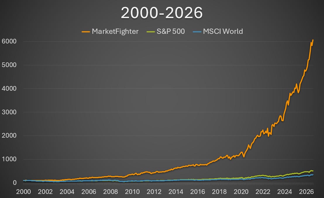
I compare with the S&P 500 and the MSCI World Index in USD (starting in index 100, all index price returns, not accounting for taxes or trading fees). I’ve traded the strategy since March 2021. All data before this point is backtested.
If the chart makes you skeptical, I’m fully with you. But this is what long term compounding does when a persistent edge is allowed to compound over many years. I have triple-checked the numbers, and everything looks correct.
So, how do you read this chart? What you can immediately tell, is that the strategy has delivered a massive excess return, regardless of whether you compare to MSCI World or the S&P 500.
What you can’t easily tell is the distribution of the excess return. For most people, a 26-year compound effect is hard to grasp or relate to. So, to give a better visual idea of what following the strategy in USD would have looked like, I decided to split the full history up in 5-year intervals.
Historical performance in 5-year intervals
The following charts are all constructed the same way and based on the same data as the one you saw above. The only difference is each covers its own 5-year period, and I reset each of them to index 100 in the beginning. The interval goes from January 1st to January 1st in the respective years.
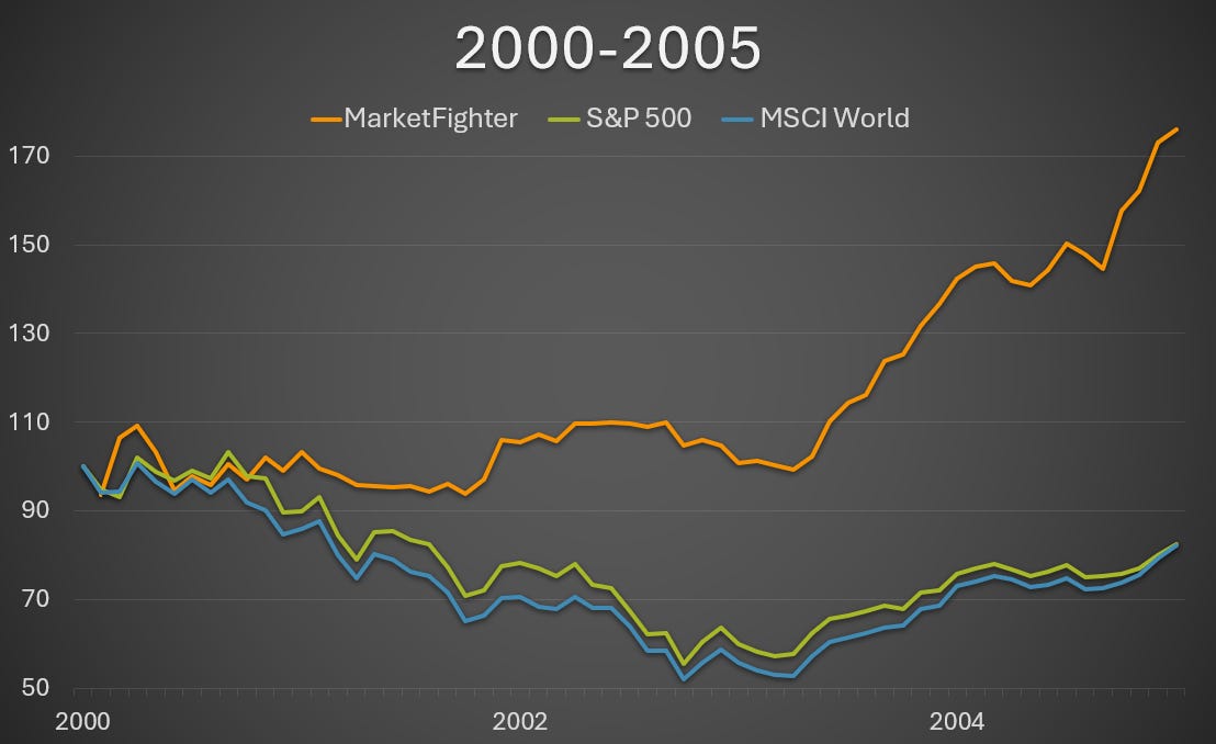
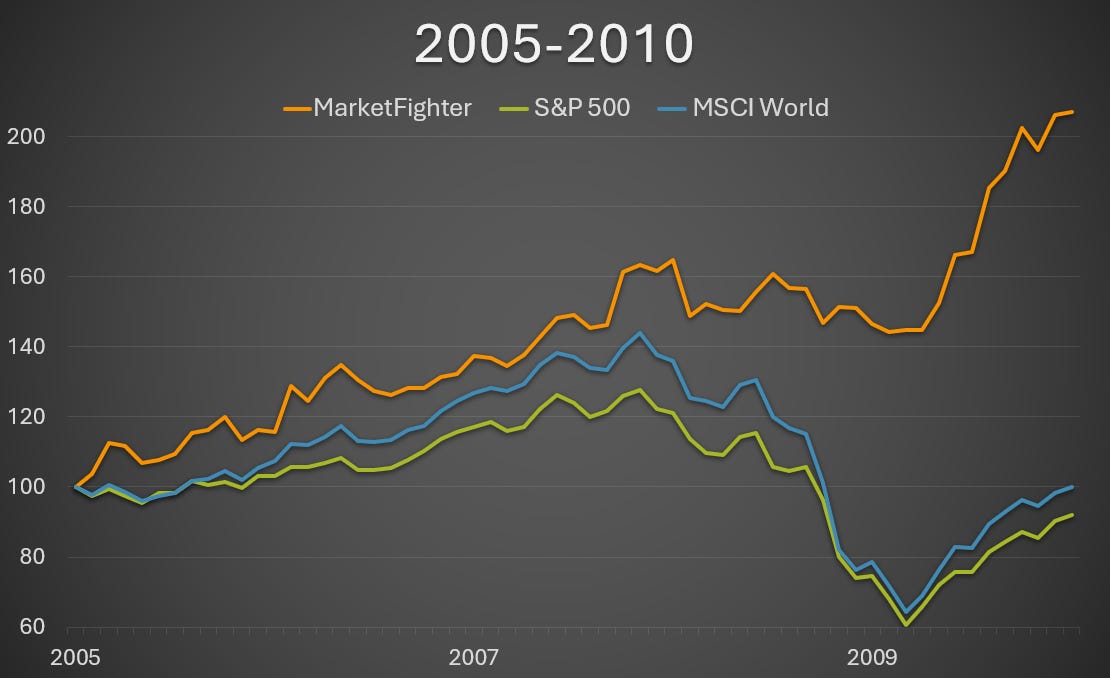
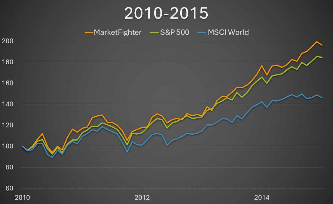
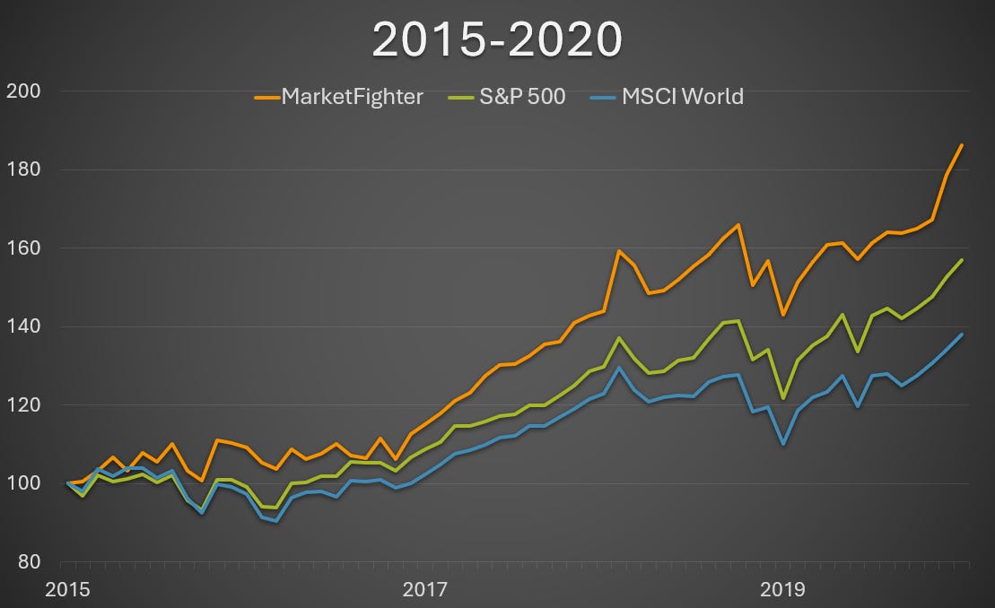
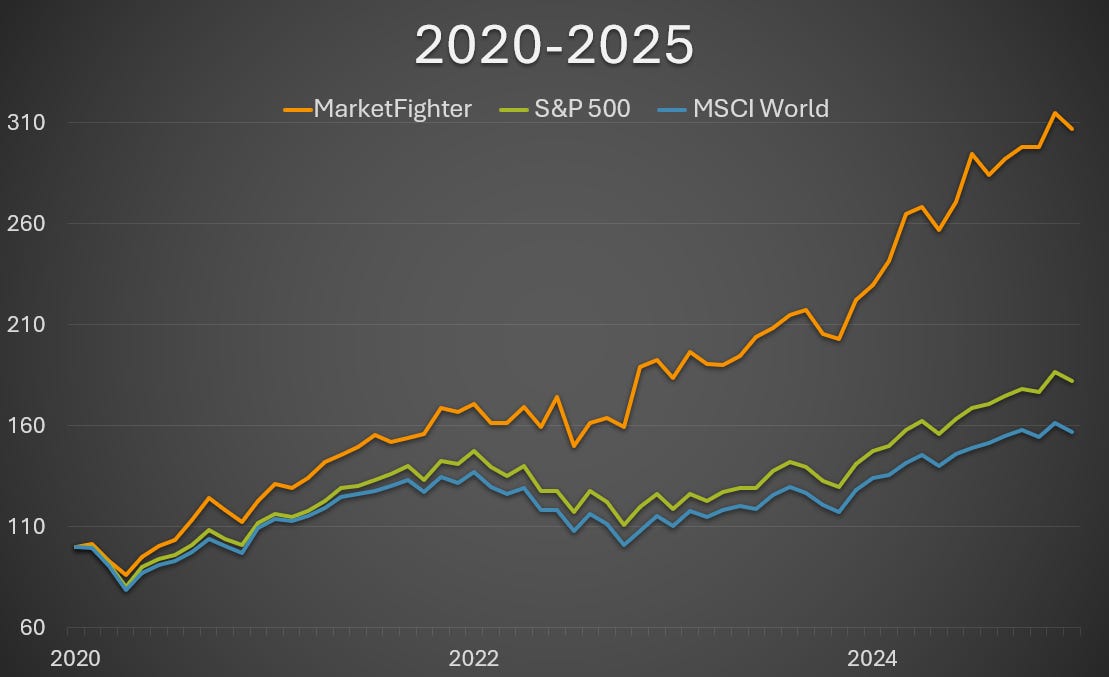
To me, these charts are easier to grasp for the eye. If you combine them, you would get the initial 2000-2026 chart (except for the last period since January 1st, 2025).
Key learnings from evaluating these charts
Scrolling down through these charts, there are a few points worth noting:
The strategy significantly outperformed both USD-benchmarks in all of the 5-year periods.
The excess returns were the strongest during the crisis years of the first two intervals (particularly 2000-2002 and 2008-2009)
Outperformance was stronger during “the lost decade” for US stocks in the 2000s than while US stocks thrived in the 2010s.
The strategy reaped the benefits of the US market when it was strong, and moved to European factor ETFs when it was weak.
These visualizations are as new to me as they are to you, and I must admit it is extremely satisfying for me to see that my strategy has performed so well, regardless of currency (USD vs. EUR) or benchmark (S&P 500 vs. MSCI World).
Still outperforming in 25 of 26 years?
A lot of you have already read the post where I displayed performance in EUR:
➡️ My Investment Approach that Outperformed the Stock Market in 25 of 26 Years
The obvious question is: Does the claim of the title still hold? Changing all data to USD-based numbers and switching the benchmark to S&P 500 does change the numbers, but not as much as one could have thought.
To sum it up, the USD-version of the strategy only beat the S&P 500 in 22 of 26 years. The four losing years were 2011, 2012, 2014 and 2016. But here’s an important detail: The worst relative underperformance measured (in 2012) was just -2.4%.
And to complete the picture, the USD-version of the strategy beat the USD-version of the MSCI World Index in 24 of 26 years. Very close to the 25 of 26 years achieved by the EUR-version.
The currency effect
Getting back to my point in the beginning of this article: The main reason for the varying performance numbers seen from a USD-based investor vs. a EUR-based one, is the currency movements.
People tend to underestimate this. I think it’s a common belief that the EUR/USD relation is somewhat steady. But take a look at the chart below to get an idea of how much it actually swings:
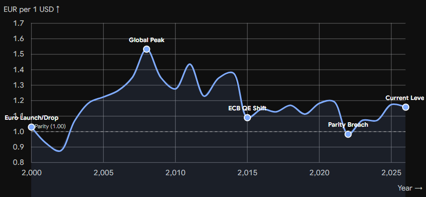
Over the past 26 years it has moved up and down in an interval between 0.82 and 1.60. This has a massive effect on the experienced market returns each year.
Personally, I find currency fluctuations annoying, as they add noise to the actual equity returns. But I try to simply ignore them, as the effect tends to smooth out over time.
Don’t get fooled by the numbers
We have established currency as the most important difference between the returns I display, and what you may find yourself. Here’s a quick list of other factors that can alter the returns and explain why two people trading the same strategy will never see the exact same returns:
Reading indices vs. ETFs
Reading specific ETF implementations
Measuring Net Totals vs. Price Returns
Trading fees
The actual buy and sell prices achieved
Tax regimes
All of this unfortunately makes comparing return metrics inherently difficult.
A note on account types
Speaking of taxes: To be honest, the topic of foreign account types and taxes is far out of my comfort zone. I have very little knowledge on rules and tax regimes of countries other than Denmark.
So, while I don’t give advice, I need to mention one thing here, since this is a US-focused post: if I had the option to trade my strategy in a tax-deferred account, I would jump at it immediately to avoid the ongoing capital gains tax.
In Denmark this is not an option. We have no such thing as a non-taxable account. Still the returns of the strategy have been far superior to buying an index fund and just letting it compound.
In the US you have both IRAs (Roth and Traditional) and 401(k)s (Roth and Traditional as well) which all allow you to trade without ongoing capital gains tax.
This is of course relevant for readers in all countries where tax-deferred accounts exist. If you don’t have this option, don’t worry. Despite the heavy Danish tax system, the returns of the strategy have still been very good to me.
Backtesting vs. real trading
Now, let’s take a look at realities. I love backtesting strategies. Only when you have a completely rules-based strategy, you can create a backtest to see how it would have performed. And only when you backtest a strategy, you will know if it has (or rather had) an edge.
But I’m also aware of the many pitfalls to backtesting. Results achieved after the backtest are the only true measure of success, and the ones that mean the most to me.
The final performance chart below covers the period where I personally traded the strategy with my own money. This was initiated on March 1st, 2021 after finalizing the backtest:
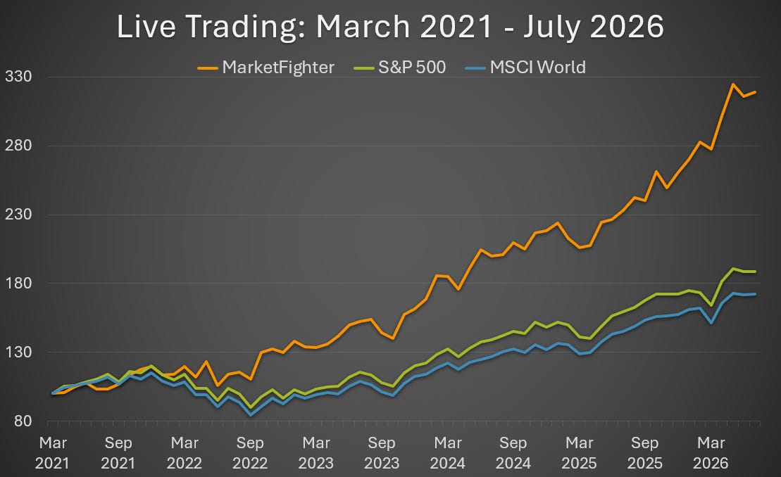
This chart reflects the raw performance of the indices the strategy trades, measured in USD (like all the charts above). It does not reflect my trading account, which is measured in Danish Kroner and is affected by my personal trading fees and taxes. These are very individual parameters.
Regardless of whether we measure in USD or EUR (or Danish Kroner) I’m more than satisfied with the results so far. During these 5 years and 5 months of real trading it has:
More than doubled the S&P 500 returns
More than tripled the MSCI World returns
More than tripled my money
These are the results that allowed me to quit my job as a software engineer earlier this year, and I’m beyond grateful for my findings.
Will this continue in the future? I often get this question, and to be quite frank, nobody knows. That’s how markets are. You can never guarantee anything for the future.
What I do know is that the strategy relies on market anomalies that have existed for decades, if not centuries. These are caused by human psychology and instincts that Homo Sapiens developed thousands of years ago.
That’s why I’m confident enough to trust most of our family funds with this system, but you can never guarantee anything in financial markets.
Ready to join?
If you found this article interesting, and you’re not part of the journey yet, don’t forget to subscribe. I provide a number of free articles like this one every month.
If you want to receive the monthly trading signals and get full access to the strategy, simply upgrade to the paid subscription to join us. (Psst: You get the best price by doing this through a web browser and not inside the Substack mobile app!)
Thanks for reading!
Disclaimer: The MarketFighter Strategy is for educational and informational purposes only. It is not financial advice, and the author is not a licensed investment advisor. Investing in ETFs involves significant risk, and past performance is never a guarantee of future results. You are solely responsible for your own trades and financial outcomes. Read the full Disclaimer here.
Good job. It doesn't matter how currency affect that. If it is someone's concern, they can always hedge or trade already hedged instrument.
Nice one 👍 what instruments have you traded during the active trading phase? Is it a swing strategy mostly?